#structure of absences
str(absences)

#structure of rurality
str(rurality)8 Basic Tidyverse Manipulation
This chapter will introduce you to the basics of working with the tidyverse. After completing these exercises, you should be able to:
- Read in data using a relative file path
- Use the
mutate,filter,rename,summarise, andselectcommands from the tidyverse package - Create a descriptive statistics table using the gt package
- Create basic visualizations and describe data distributions (histogram, boxplot/violin plot, scatterplot, bar chart)
We will use the following datasets:
- Data on chronic school absence rate for North Carolina Public Schools before and after the Covid-19 pandemic from the North Carolina Department of Public Instruction
- North Carolina census tract rurality definitions (RUCA codes) from the USDA Economic Research Service and the NC Rural Center. RUCA codes establish urban cores and the census tracts that are the most economically integrated with those cores through commuting. The NC Rural Center defines rurality as areas with less than 250 residents per square mile.
8.1 Creating a .Rmd and Reading Data
To follow along with this tutorial, you should create a new .Rmd document and save it into your GEOG215 folder. Once you’ve saved it, close the file and re-open it. Every time you see code below, you should copy it to your own document!
Q1: Once you re-open the folder, what is your current working directory? How do you know?
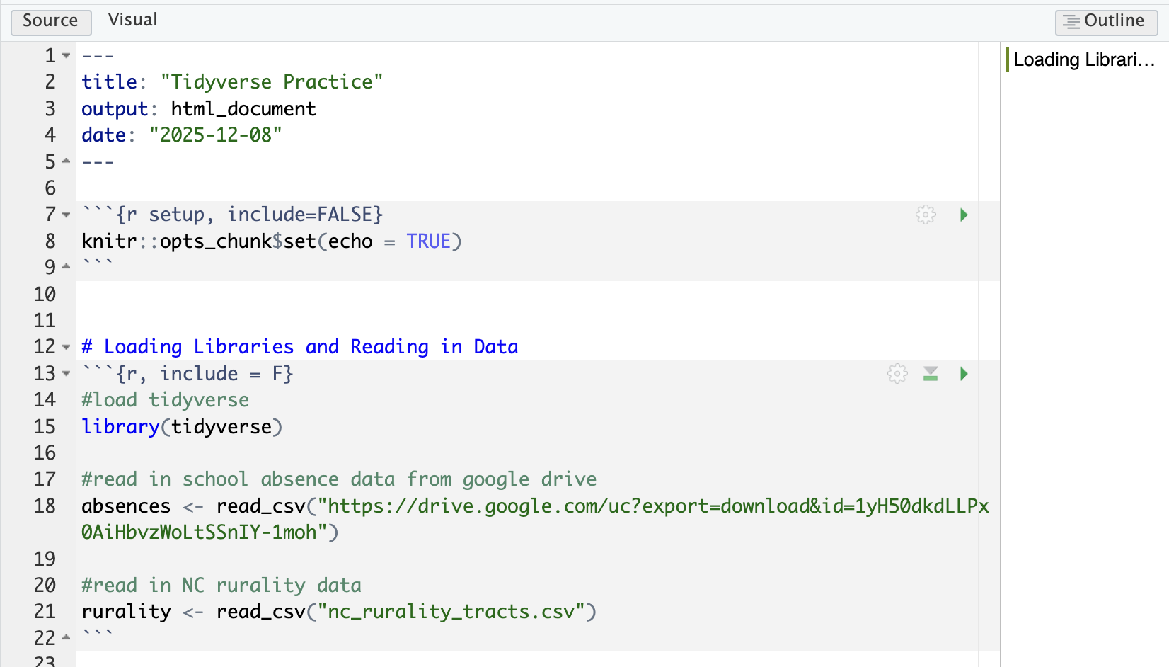
Remove all the code chunks except for the setup chunk. Below the setup chunk add a “first-level header” called “Loading Libraries and Reading in Data”.
Then add a chunk below this text and load the tidyverse package. Format that chunk so that it is not included in the knitted document.
You will read in the school absence data directly from Google Drive using the following command:
absences <- read_csv("https://drive.google.com/uc?export=download&id=1cDHtaBhZpTwTct77f53kSmurSNG4hAI-")
To practice reading in data locally, download the NC Rurality Data to your GEOG215 folder (or whatever subfolder you have your .Rmd file saved to). Then, write a relative file path to read in that file. You will use the command
rurality <- read_csv("RELATIVEFILEPATH")
Your .Rmd should now look something like this
8.2 Running Chunks and Knitting
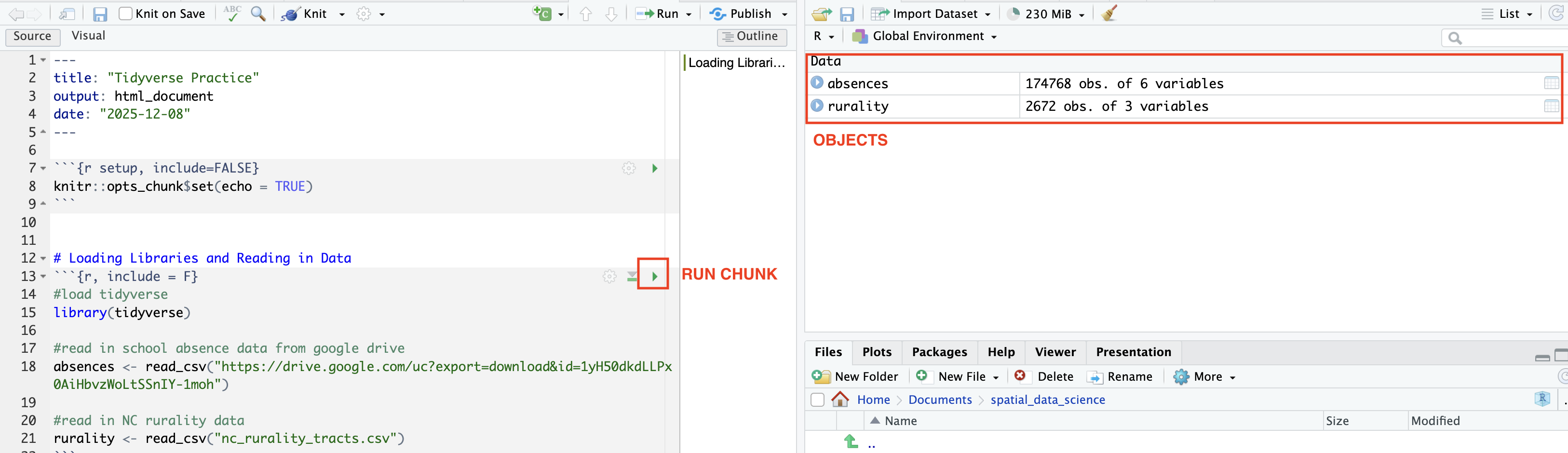
We have completed our code chunk for loading libraries and reading in data. Now we can”Run” or evaluate that code. We can evaluate a code chunk by clicking the green arrow. Once you’ve evaluated the chunk, the datasets should show up in your Environment. Those are now “Objects”
Now practice knitting your document using the Knit button on the top panel. This should create a new .html file that will be saved in your working directory. The file will open in a new window.
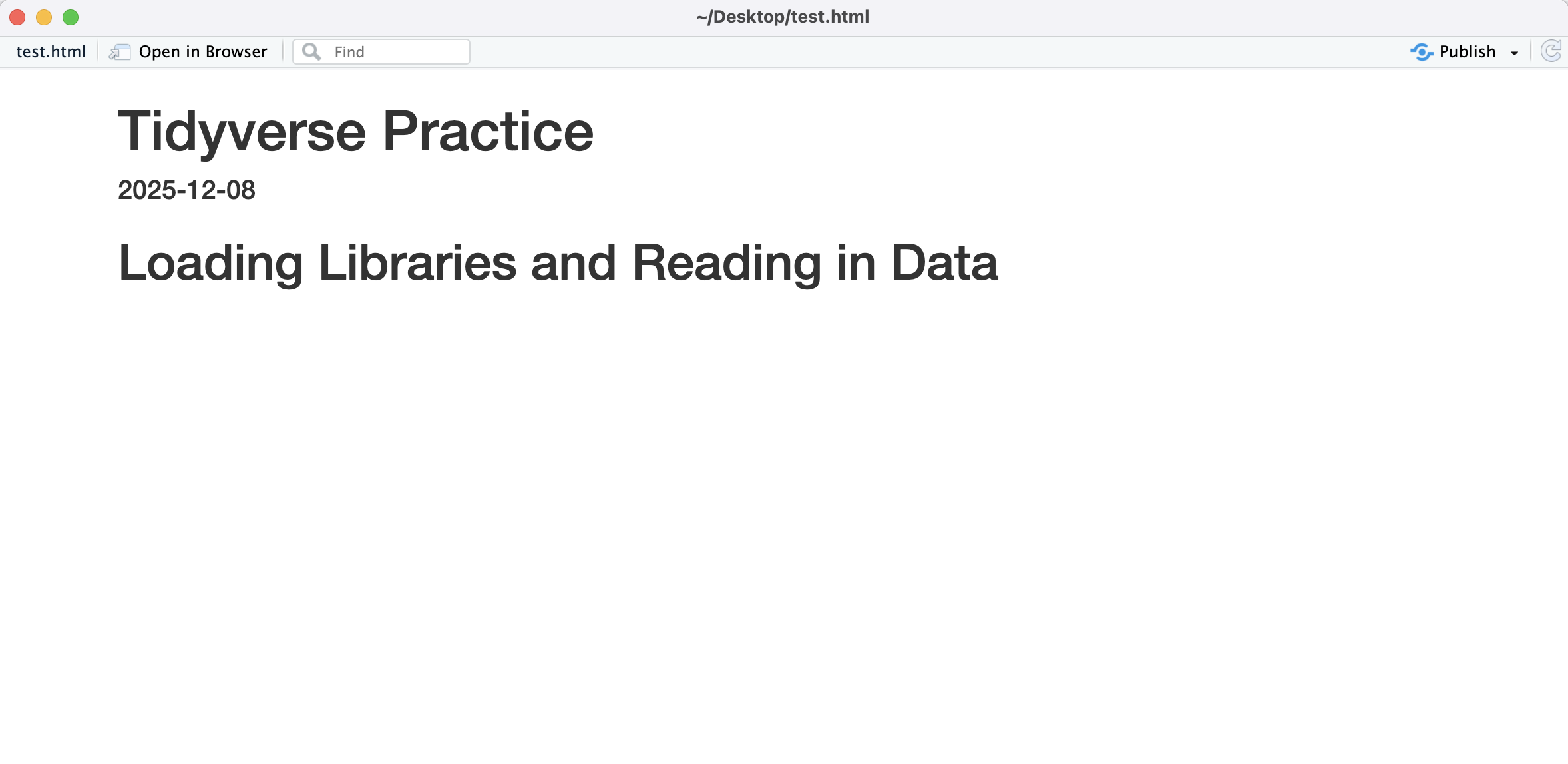
Q2: Why does the knitted document not include our code?
8.3 Data Structure in the Tidyverse
Add a first-level header called “Using the Tidyverse”. Under the header, add a code chunk
For the most part, we will be working with a special data structure called a tibble. A tibble is tidyverse’s version of a data frame. In a tibble, each row is an observation and each column is a variable. This is called “tidy” data.
To get a basic understanding of our data, we can use the str command:
You should also double-click each object in the “Environment” tab. This will open the tibble so that you can explore it.
Q3: How many rows are in the absences dataset?
Q4: How many variables are in our rurality dataset?
Q5: What is the data type of the year variable in the absences dataset?
Q6: Which of the absences variables are characters?
Basic data manipulation in the tidyverse generally involves “piping”. Piping is the way that we can “chain” operations or commands and it looks like this: |> (in documentation you might also see a pipe written like this %>%). Run each of the following commands and add a descriptive comment above it.
#
absences |> slice_head(n = 5)

#
absences |> select(1)

#
absences |> select(rural)

#
absences |>
  summarise(mean_percent = mean(pre_covid_pct))

#
absences |>
  summarise(max_percent = max(after_covid_pct))

#
rurality |> summarise(n_rural = sum(nc_rural_center == "Rural"))

#
summary <- absences |>
  summarise(max_before_covid = max(pre_covid_pct), max_after_covid = max(after_covid_pct))
Q7: Why wasn’t the last command printed to the console?
Q8: Write a command that creates an object called metro_core and counts the number of observations that have a ruca_code of “Metropolitan Core”
Usually, unless we are doing basic data exploration, we want to save our manipulated data as objects. You can either “re-write” an object by using the same name, or you can re-name the manipulated object. Run each of the following commands and add a descriptive comment above it.
#
non_rural_data <- absences |> filter(rural == "non-rural")

#
pre_covid <- absences |> select(agency_code, pre_covid_pct)

#
renamed_absences <- absences |> rename(pre_covid_ratio = pre_covid_pct, after_covid_ratio = after_covid_pct)

#
added_column <- renamed_absences |> mutate(change = after_covid_ratio - pre_covid_ratio)

#
logical <- renamed_absences |> mutate(high_absence = ifelse(pre_covid_ratio > .25, 1, 0))

#
logical_rural <- rurality |> mutate(highly_rural = ifelse(ruca_code %in% c("Small town low commuting", "Rural area", "Small town core"), "Highly Rural", "Not Highly Rural"))
Q9: Write a command that creates an object called high_absence_schools that filters the logical object to just schools that have a high absence rate before Covid.
Q10: Write a command that creates an object called urban that filters the rurality object to just observations that are “Metropolitan high commuting” or “Metropolitan core”
8.4 Descriptive Statistics
Descriptive statistics allow us to understand the distribution of our dataset. We can use a similar command structure to create almost all of the descriptive statistics tables in our class. Add a first-level header called “Describing the Data”. Add a code chunk below.
##Notice that you need to add these libraries. You might need to install them.
library(e1071)
library(gt)

#calculate descriptive statistics
pre_covid_stat <- absences |> select(pre_covid_pct) |>
  summarise(
    n = n(),
    num_na = sum(is.na(pre_covid_pct)),
    mean_pct = mean(pre_covid_pct, na.rm = TRUE),
    median_pct = median(pre_covid_pct, na.rm = TRUE),
    sd_pct = sd(pre_covid_pct, na.rm = TRUE),
    variance_pct = var(pre_covid_pct, na.rm = TRUE),
    mean_dev = mean(abs(pre_covid_pct - mean(pre_covid_pct, na.rm = TRUE)), na.rm = TRUE),
    min_pct = min(pre_covid_pct, na.rm = TRUE),
    max_pct = max(pre_covid_pct, na.rm = TRUE),
    skewness = skewness(pre_covid_pct, na.rm = TRUE),
    kurtosis = kurtosis(pre_covid_pct, na.rm = TRUE)
  )

##this will format the table for display
display_table <-  pre_covid_stat |> pivot_longer(everything(), names_to = "Statistic", values_to = "Value") |>
  gt() |>
  tab_header(
    title = "Chronic Absences at NC Public Schools before Covid-19",
  ) %>%
  fmt_number(
    columns = everything(),
    decimals = 2
  )

#display the table
display_table


### CATEGORICAL DATA #####
## create a basic table of descriptive statistics for NC Rural Center Rural Definition
rural_table <- rurality |>
  group_by(nc_rural_center) |>
  summarise(n = n())  |>  gt()

rural_table
8.5 Basic Plotting with ggplot2
Data visualizations can add additional information to our descriptive statistics table. Add a first-level header called “Plotting our Data”. Add a code chunk below it.
8.5.1 The “Language” of ggplot2
The ggplot2 package builds visualizations using a conceptual framework based on the grammar of graphics– meaning that every graph can be built from the same components. These components are a dataset, a coordinate system, and geoms (visual marks that represent data points). The basic “formula” of a ggplot is:
1) Start with the data -> ggplot(DATAFRAME,
2) Map variables to aesthetics -> aes(x = , y =, color = , size = , shape= )
3) Add layers (what kind of graph) -> + geom_***
For instance, a basic scatterplot could look like
ggplot(data, aes(x = var_for_x_axis, y = var_for_y_axis)) + geom_point()
We will work extensively with ggplot2 graphs in this class. The following examples provide a very brief introduction on using ggplot2
8.5.2 Histogram/ Density Plot
A histogram is a graph that displays the frequency of observations within user-set “bins”. A density plot is a smooth curve that shows the distribution of the data. The curve represents the proportion of the data in each range rather than the frequency. Both of these visualizations help us understand the distribution of our data
## create a histogram of pre covid absences
#absences is our data, x is the variable for x axis (no y axis with histograms, since it is frequency)
#binwidth is how large each bin is
#alpha sets the transparency
#labs adds labels
ggplot(absences, aes(x = pre_covid_pct)) +
  geom_histogram(binwidth = .05, fill = "lightgrey", color = "black", alpha = 0.7) +
  labs(
    title = "Histogram of Pre Covid Absences",
    x = "Absence Ratio",
    y = "Frequency"
  )

## create a density plot of pre covid absences
ggplot(absences, aes(x = pre_covid_pct)) +
  geom_density(fill = "lightgrey", color = "black", alpha = 0.7) +
  labs(
    title = "Density Plot of Pre Covid Absences",
    x = "Absence Ratio",
    y = "Proportion"
  )
8.5.3 Boxplot
A boxplot is a standardized way of displaying the distribution of data based on a five-number summary: minimum, first quartile (Q1), median, third quartile (Q3), and maximum. It can also highlight outliers in the data.
## absences is the data
## y axis only (if you wanted to flip the box plot, you would use x = )
ggplot(absences, aes(y = pre_covid_pct)) +
  geom_boxplot(fill = "lightgrey") +
  labs(
    title = "Boxplot of Chronic Absences",
    y = "Ratio"
  )
8.5.4 Violin Plot
A violin plot is a method of plotting numeric data and can be understood as a combination of a boxplot and a density plot. It shows the distribution of the data across different values.
##Look how we've layered two different plot types onto the same graph
ggplot(absences, aes(x = 1, y = pre_covid_pct)) +
  geom_violin(fill = "lightgrey", bw = .05)  + geom_boxplot(width=0.3) +
  labs(
    title = "Violin Plot of of Chronic Absences",
    y = "Ratio"
  ) + theme(axis.title.x=element_blank(),
        axis.text.x=element_blank(),
        axis.ticks.x=element_blank())
8.5.5 Bar Chart
A bar chart displays the count of each observations in a group. It is a useful visualization for nominal/categorical data.
#this creates the grouped dataset
grouped_rural <- rurality |>
  group_by(ruca_code) |>
  summarise(Count = n())

#this plots the bar plot (note that the coord_flip swtiches the axis which is better for labeling in this case)
ggplot(grouped_rural, aes(x=ruca_code, y=Count)) +
  geom_bar(stat = "identity") + coord_flip() + labs(
    x = "RUCA Code Category",
    y = "Number of Census Tracts",
  )
8.5.6 Faceting and Grouping Plots
Faceting and grouped visualization are two ways to compare distributions across categories in ggplot2. Faceting creates separate panels for each level of a categorical variable, making it easy to see each group individually. Grouped visualization overlays multiple groups in a single plot, using color or fill to distinguish them, so you can compare distributions directly. In both cases, the variable used to define the groups must be categorical (like rural), because these techniques rely on discrete levels to separate or color the data.
##grouped visualization (see fill value)
ggplot(absences, aes(x = pre_covid_pct, fill = rural)) +
  geom_density(binwidth = .05, alpha = .7) +
  labs(
    title = "Histogram of Pre Covid Absences",
    x = "Absence Ratio",
    y = "Frequency"
  )

#faceted visualization (see facet_wrap)
ggplot(absences, aes(x = pre_covid_pct)) +
  geom_density(binwidth = 0.05, alpha = 0.7, fill = "lightblue") +
  facet_wrap(~ rural) +   # create separate panels by the 'rural' variable
  labs(
    title = "Density of Pre-Covid Absences by Rural Category",
    x = "Absence Ratio",
    y = "Density"
  )
#violin plots and box plots use the x variable to look at categories
ggplot(absences, aes(x = rural, y = pre_covid_pct)) +
geom_violin(fill = "lightgrey", bw = .05) + geom_boxplot(width=0.1) +
labs(
title = "Violin Plot of Summer Temperatures (1991-2020)",
y = "Summer Temperature (°F)"
) 8.6 Mini-Challenge
Add a new first level header called “Mini-Challenge #2”. Under that header, add a code chunk. In the code chunk, write commands to do the following:
- Make a descriptive statistics table of
after_covid_ratio - Make a descriptive statistics table of
ruca_code - Make a histogram and density plot of after covid absences
- Make a violin chart of after covid absences
- Make a bar chart of NC Rural Center rural definition