library(tidyverse)
library(sf)
library(tmap)
nc_counties <- st_read("https://drive.google.com/uc?export=download&id=1g9sGIikgOEubqoj97fUVoCYAKlBDVX5a")
durham_schools <- st_read("https://drive.google.com/uc?export=download&id=1ajKBLeKpFMW8z0HCbnLi4C44tgryCsRt") 13 Advanced tmap
We’ve already made many simple maps using the tmap package. Now that we know more about cartographic design, we can explore the more advanced features of tmap. This chapter does not cover everything. For much more information on making good maps in tmap, this is a great resource: Spatial Data Visualization with tmap
After completing these exercises, you should be able to:
- Apply visual variables other than color (size, shape)
- Select color palettes
- Select appropriate classification schemes
- Make interactive and static maps using a basemap
- Add basic formatting to a tmap
We will use our NC county boundary and Durham schools data to practice our tmap visualization.
13.1 Visual Variables
13.1.1 Color
We are already familiar with making a basic tmap using color to visualize patterns:
tm_shape(nc_counties) + tm_polygons(fill = "POP2020")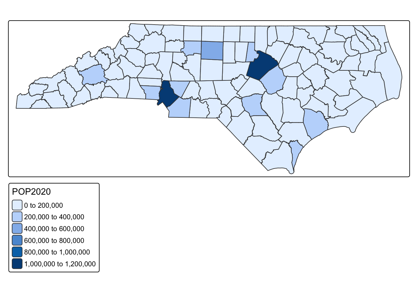
13.1.2 Size
We can also represent variables by size
tm_shape(nc_counties) + tm_symbols(size = "POP2020")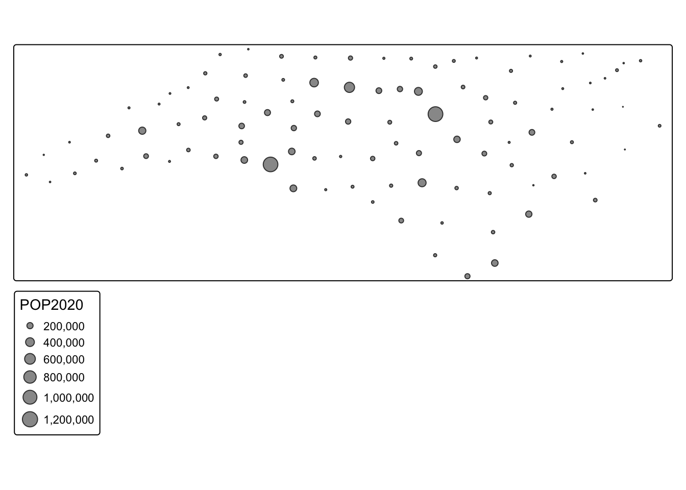
13.1.3 Size and Color
Or both!
tm_shape(nc_counties) + tm_symbols(size = "POP2020", fill = "POP2020")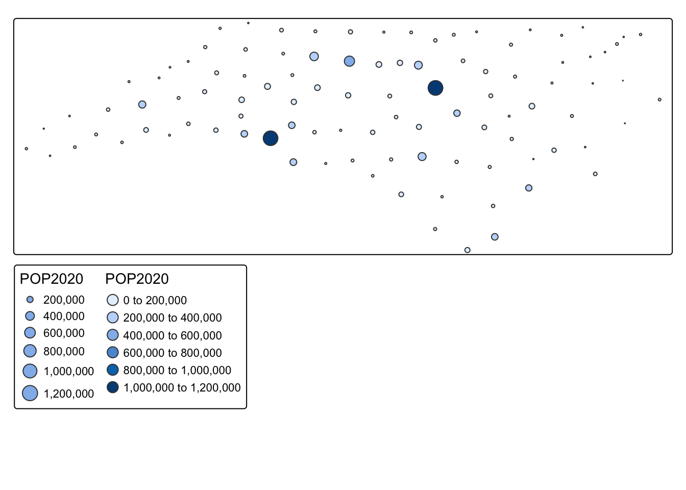
13.1.4 Shape
For categorical variables, we can also use shape
#with symbols there are a default of 5 symbols. If you have more than 5 categories, you need to specify which shapes to use using the shape.scale() argument
tm_shape(durham_schools) + tm_symbols(shape = "factype", shape.scale = tm_scale(values = c(0, 1, 2, 3, 4, 5, 6, 7, 8, 9)))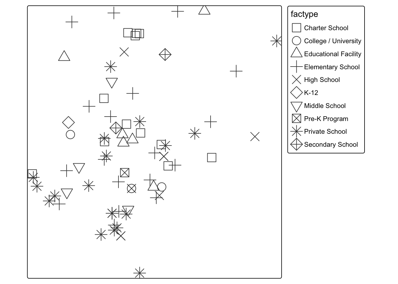
13.2 Color Palettes
We can also modify the color palette. To see all the available color palettes, you should run the command below
cols4all::c4a_gui()tm_shape(nc_counties) + tm_polygons(fill = "POP2020", fill.scale = tm_scale_intervals(values = "bu_pu"))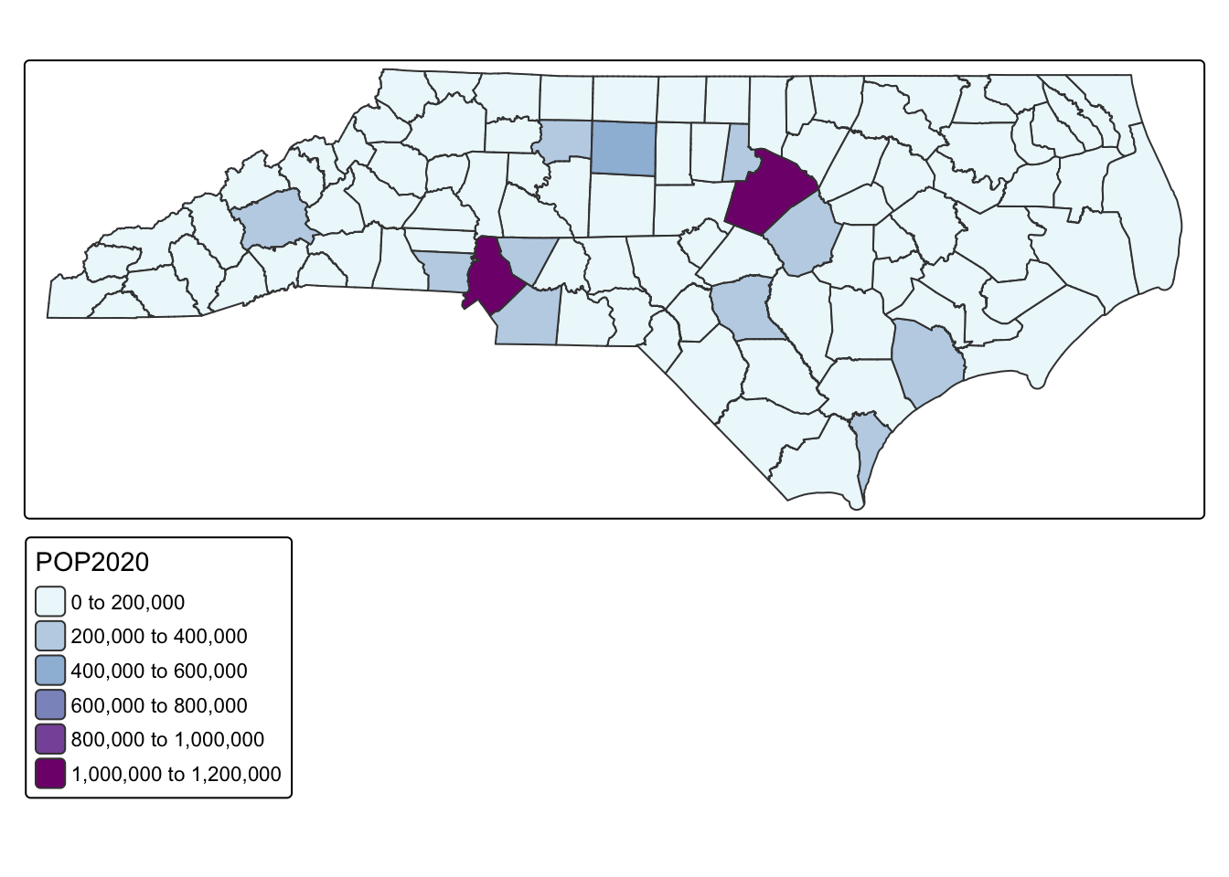
13.3 Classification Schemes
One of the biggest decisions we can make is how to classify our data. You can see in the maps above that tmap defaults to an equal interval color scheme. However, this is often not the best way to classify the data. Your decision about classification should be made based on the distribution of the data. Let’s look at the distribution of the median age variable
ggplot(nc_counties, aes(x = POP2020)) + geom_histogram()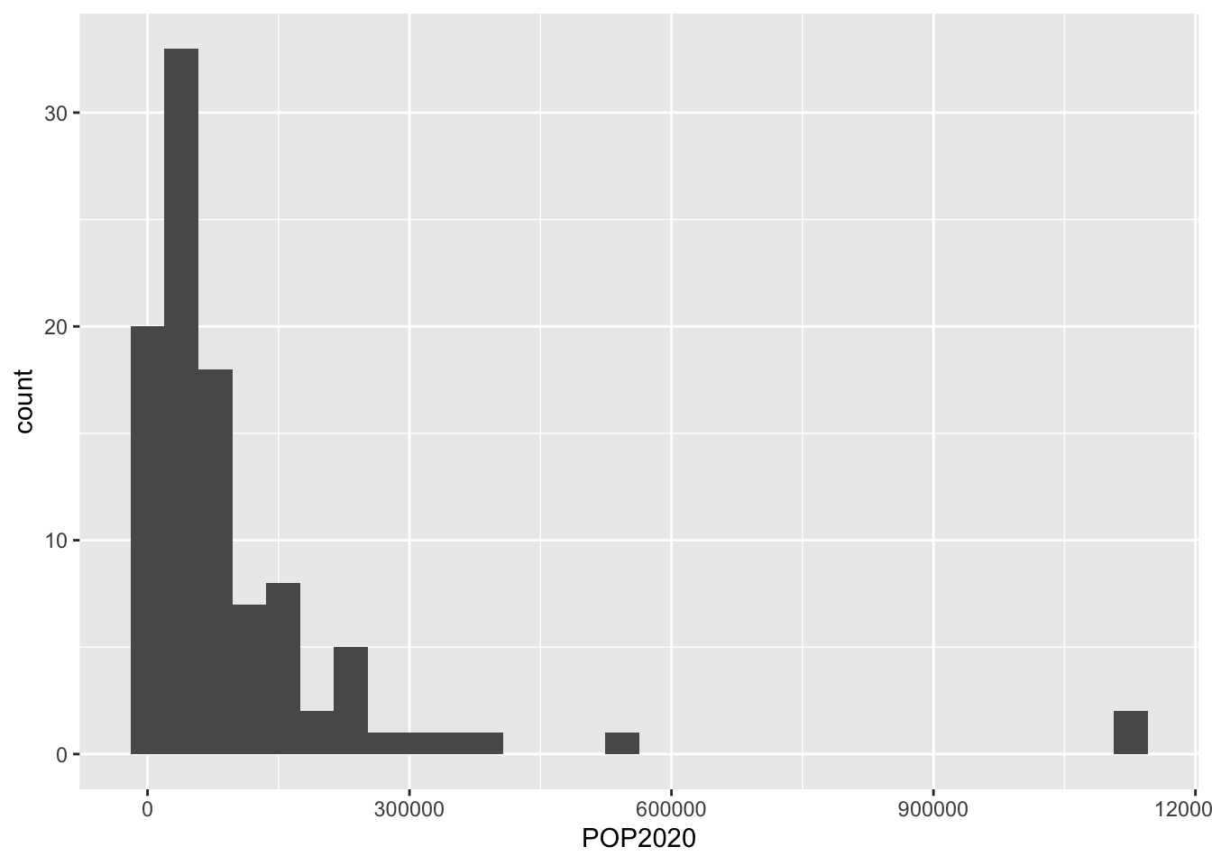
Because so much of our variation is between below 200,000, using an equal interval color palette makes it difficult to visualize the majority of the variation. See how different the map looks when we use a quantile classification scheme?
tm_shape(nc_counties) + tm_polygons(fill = "POP2020", fill.scale = tm_scale_intervals(values = "bu_pu", style = "quantile"))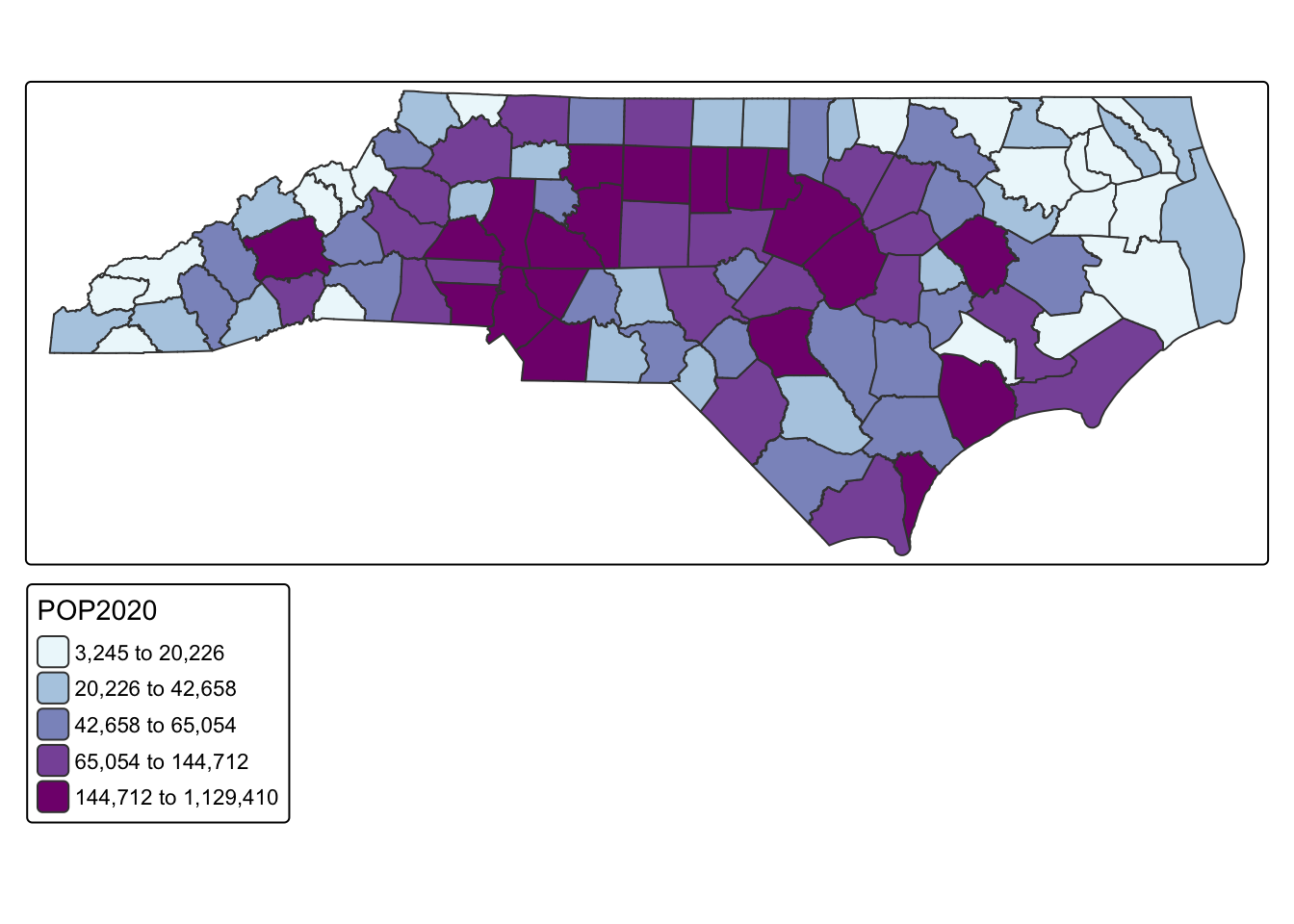
The following classification schemes will cover most of your uses:
- equal
- pretty
- quantile
- fisher (natural breaks)
13.4 Interactive Mapping
So far, we have only made mostly static maps. However, tmap has the availability to make interactive maps as well.
## make an interactive map
tmap_mode(mode = "view")
tm_shape(nc_counties) + tm_polygons(fill = "POP2020", fill.scale = tm_scale_intervals(values = "bu_pu", style = "quantile"))