#load libraries
library(terra)
library(tidyverse)
library(tmap)

#read in canopy raster
canopy_raster <- rast("https://drive.google.com/uc?export=download&id=1qxedXO256Xf-dP-rSeE0icQ-Hi-a3ioC")12 Central Limit Theorem
The Central Limit Theorem states that if a sample size (n) is large enough, the sampling distribution of the sample mean will be approximately normal, regardless of the shape of the population distribution. In general, a sample size of n > 30 is considered to be large enough for the Central Limit Theorem to hold.
Because of the CLT, we can make inferences about a population using samples, even if the original population’s distribution is unknown or not normal.
In this chapter, we will demonstrate the CLT using a raster of tree canopy coverage across the Chapel Hill Area (from the 2023 National Land Cover Dataset).
To follow along with this tutorial, make a new .Rmd document. As you move through the tutorial add chunks, headers, and relevant text to your document.
12.1 Reading in Data
Paste the following code into a chunk at the top of your document
This data represents the percent of tree cover per 30-meter pixel. When we map the data, we can see the spatial pattern in tree canopy coverage across the Chapel Hill area
#map canopy raster
tm_shape(canopy_raster) +
tm_raster(col.scale = tm_scale_intervals(values = "carto.sunset_dark", n = 5))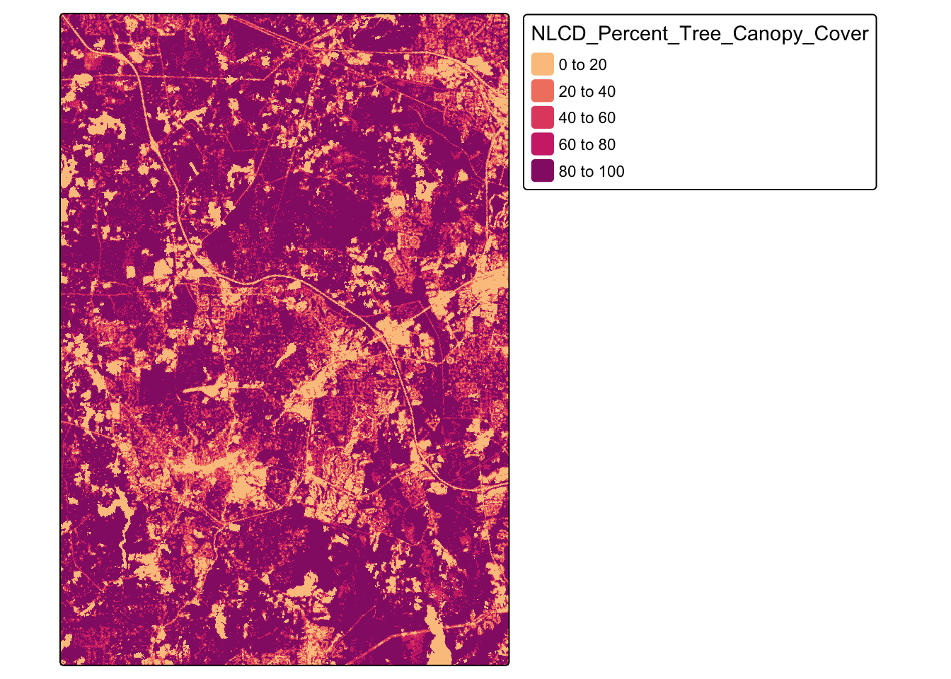
Q1: Can you pick out any known features from this map?
Because we have the entire raster, we can calculate the true mean of this raster and visualize the population distribution.
#turn raster into a dataframe
canopy_raster_df <- as.data.frame(canopy_raster, xy = TRUE)

#calculate mean and sd
tree_coverage_mean <- mean(canopy_raster_df$NLCD_Percent_Tree_Canopy_Cover)
tree_coverage_sd <- sd(canopy_raster_df$NLCD_Percent_Tree_Canopy_Cover)

#density plot
ggplot(canopy_raster_df, aes(x = NLCD_Percent_Tree_Canopy_Cover)) + geom_histogram(binwidth = 3)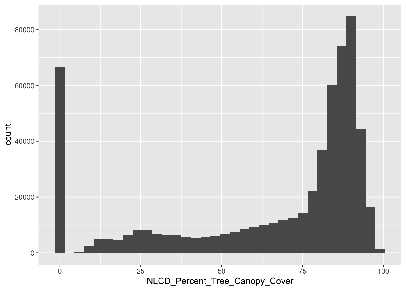
Q2: How can we interpret that mean value? What does the value represent?
Q3: What are the characteristics of the distribution of tree canopy cover across Chapel Hill?
12.2 CLT Part 1
Regardless of the population’s shape, the sampling distribution of the sample mean becomes approximately normal as the sample size increases
To test the CLT, we can take simple random samples of our raster. Let’s take 300 samples, with n = 75.
#parameters for sampling
sample_size <- 75
num_samples <- 300

#draw random samples
samples <- replicate(num_samples, sample(canopy_raster_df$NLCD_Percent_Tree_Canopy_Cover, size = sample_size,replace = TRUE))

#calculate sample means
sample_means <- colMeans(samples)

sample_means_df <- data.frame(sample_means = sample_means)

mean_of_means <- mean(sample_means_df$sample_means)

#density plot
ggplot(sample_means_df, aes(x = sample_means)) + geom_histogram(binwidth = 3)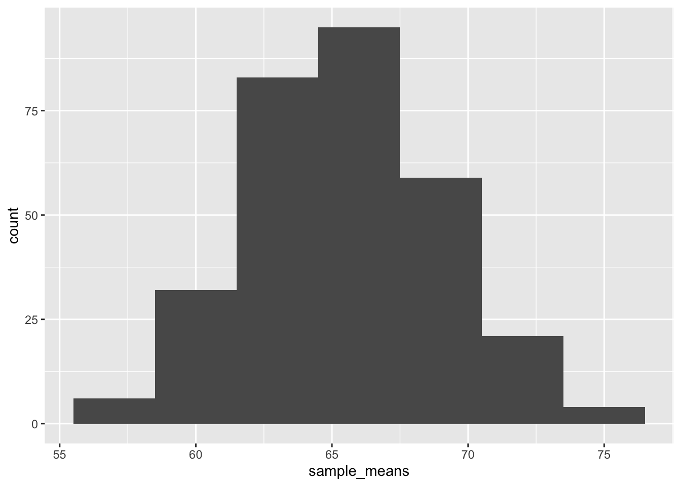
Q4: Run the code above with a smaller sample size (n = 5). Does the distribution of means still follow a normal distribution?
12.3 CLT Part 2
The mean of the sampling distribution of the sample mean will become the population mean
Q5: Calculate the mean of our sample means. How does the mean compare to the population mean?
12.4 CLT Part 3
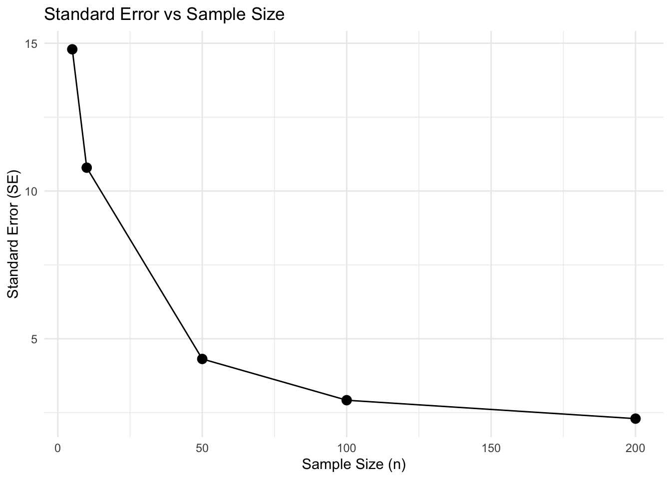
The standard deviation of the sampling distribution is called the standard error, and is related to the population standard deviation by the formula:
\[ SE = \frac{s}{\sqrt{n}} \]
where \({s}\) is equal to the sample standard deviation, and \({n}\) is the sample size.
A smaller SE means the sample mean is likely closer to the population mean, so our estimate of the mean is more accurate and precise.
We can test this by running repeated samples at different sample sizes
sample_sizes <- c(5, 10, 50, 100, 200)  # small and large sample
num_samples <- 300

se_values <- data.frame(sample_size = integer(), SE = numeric())

for (n in sample_sizes) {
  sample_means <- replicate(num_samples,
                            mean(sample(canopy_raster_df$NLCD_Percent_Tree_Canopy_Cover,
                                        size = n, replace = TRUE)))
  se_values <- rbind(se_values, data.frame(sample_size = n, SE = sd(sample_means)))
}

# Plot SE vs sample size
ggplot(se_values, aes(x = sample_size, y = SE)) +
  geom_point(size = 3) +
  geom_line() +
  labs(title = "Standard Error vs Sample Size",
       x = "Sample Size (n)",
       y = "Standard Error (SE)") +
  theme_minimal()