tm_shape(acs_tract_nc) + tm_polygons(fill = "median_age")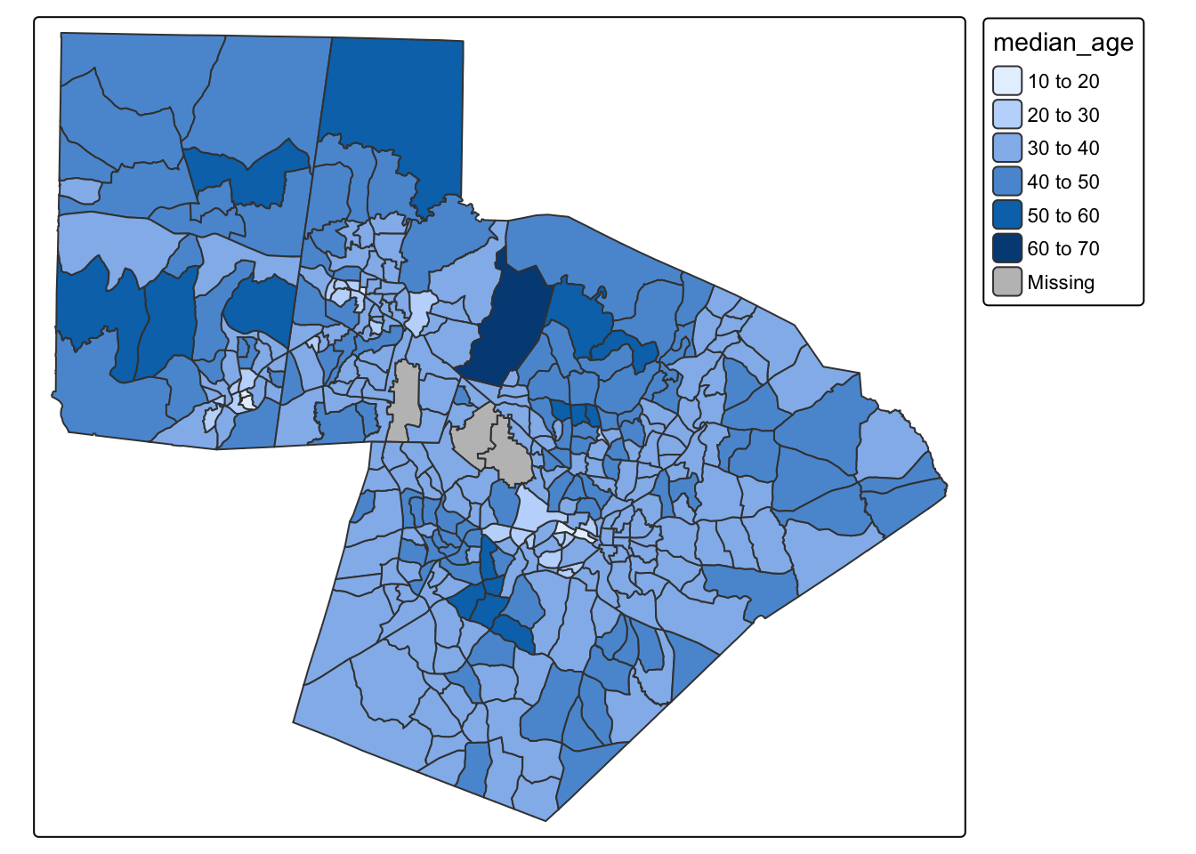
Mapping is an extremely important tool for describing and visualizing spatial data. Maps are particularly useful because they are able to summarize variation in both values and location (space). You (as a newly deputized cartographer) have a lot of control over how a map functions by making decisions on things like classification schemes, colors, layout, and design.
This tutorial is designed to introduce you the main functionalities of the tmap package. We will use census block group data to Orange, Durham, and Wake counties. This file will tell you what each variable name means.
To follow along with this tutorial, download the .Rmd template here. The template already includes a code chunk for loading libraries and reading in the data, along with labeled empty chunks for each section of the tutorial. As you work through the code examples below, add each set of commands to the chunk with the matching section heading in your template.
We are already familiar with making a basic tmap using color to visualize patterns:
tm_shape(acs_tract_nc) + tm_polygons(fill = "median_age")
We can also represent variables by size
tm_shape(acs_tract_nc) + tm_symbols(size = "total_pop")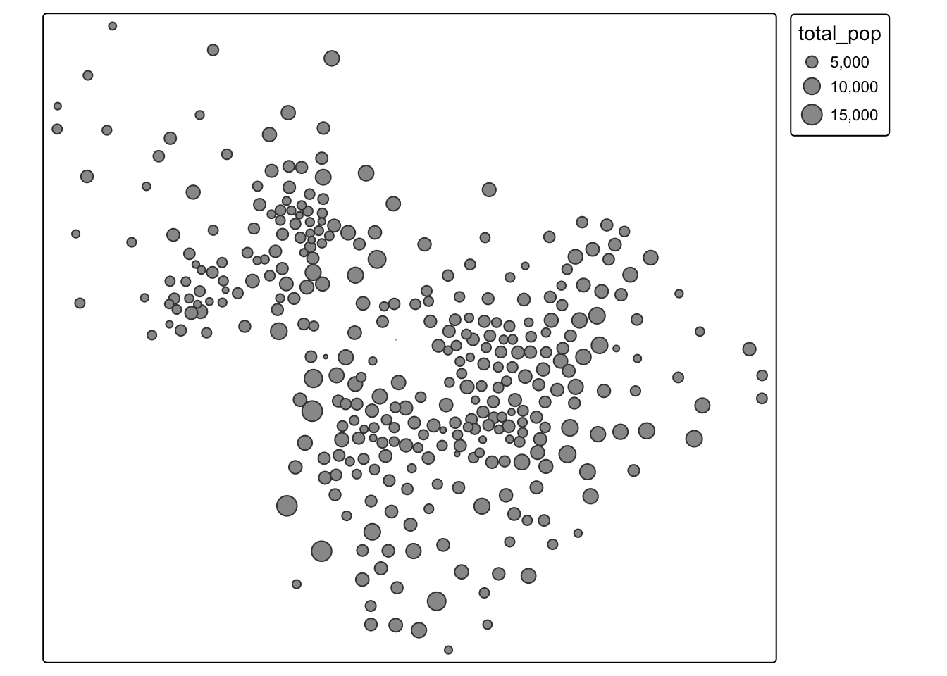
Or both!
tm_shape(acs_tract_nc) + tm_symbols(size = "total_pop", fill = "total_pop")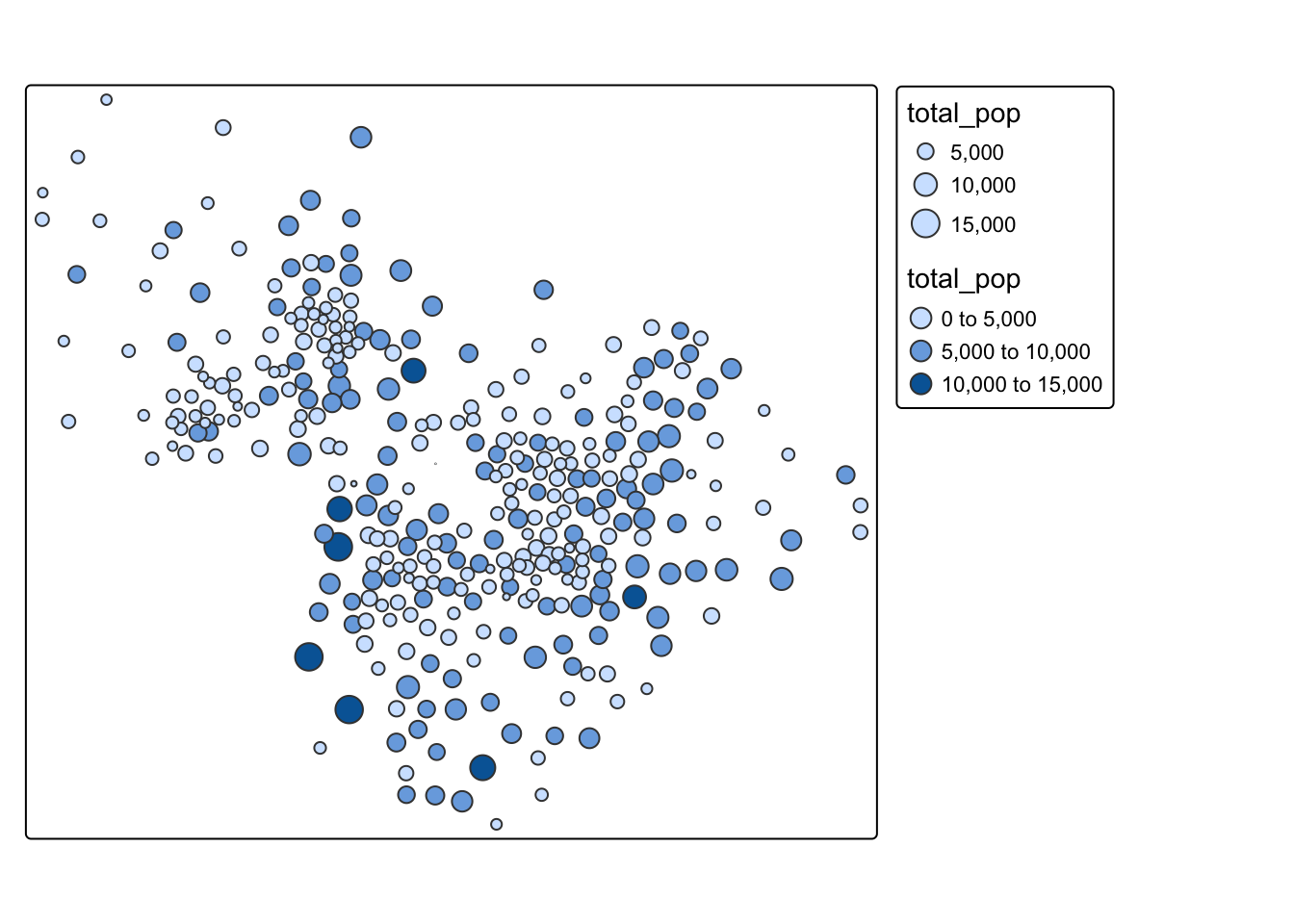
We can also modify the color palette. To see all the available color palettes, you should run the command below
cols4all::c4a_gui()tm_shape(acs_tract_nc) + tm_polygons(fill = "median_age", fill.scale = tm_scale_intervals(values = "bu_pu"))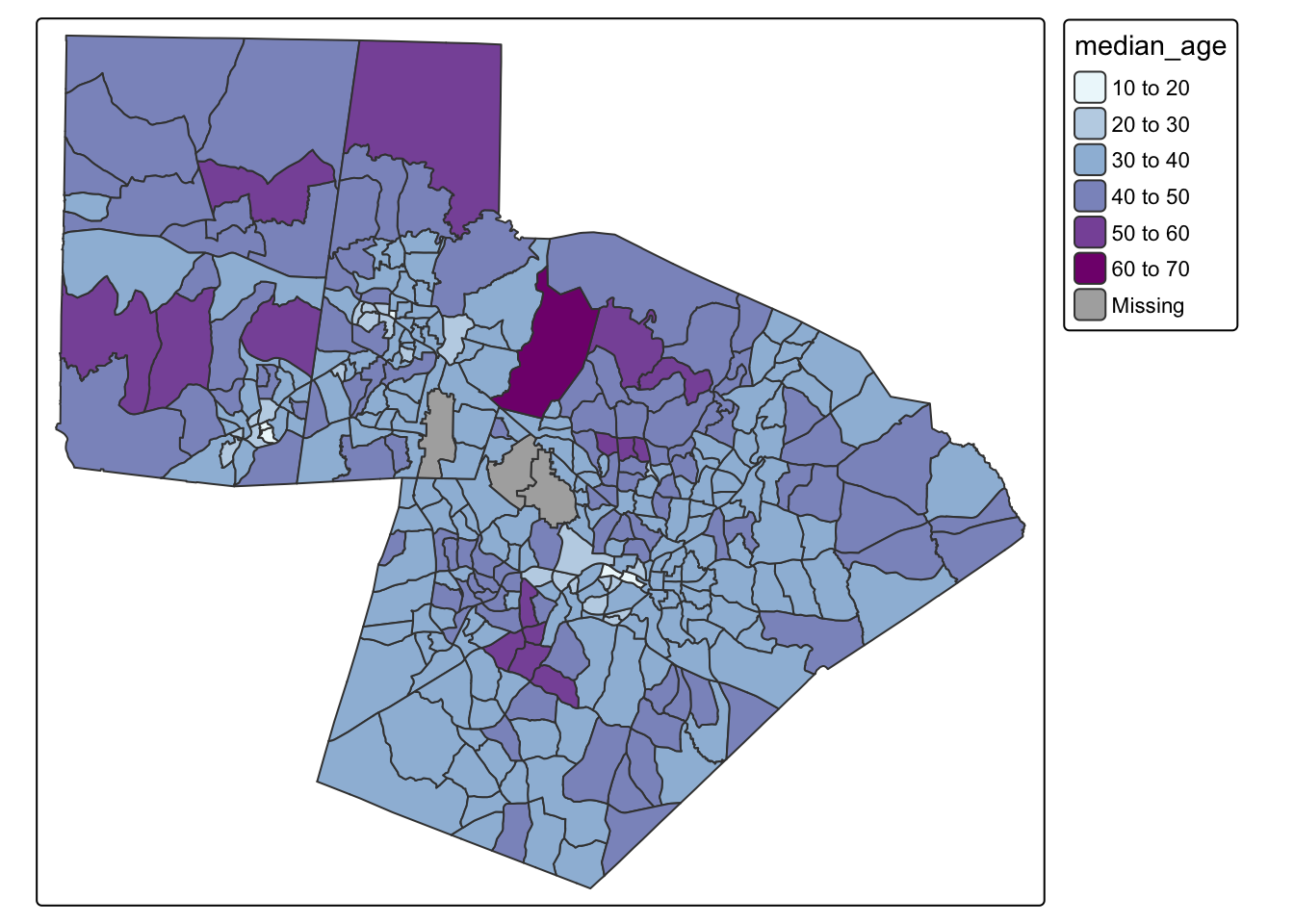
One of the biggest decisions we can make is how to classify our data. You can see in the maps above that tmap defaults to an equal interval color scheme. However, this is often not the best way to classify the data. Your decision about classification should be made based on the distribution of the data. Let’s look at the distribution of the median age variable
ggplot(acs_tract_nc, aes(x = median_age)) + geom_histogram()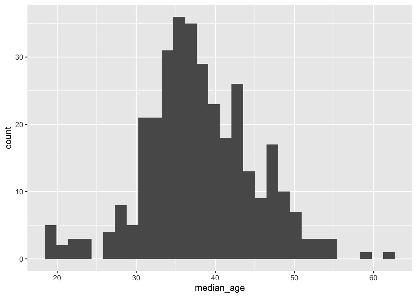
Because so much of our variation is between 30-45, using an equal interval color palette makes it difficult to visualize the majority of the variation. See how different the map looks when we use a quantile classification scheme?
tm_shape(acs_tract_nc) + tm_polygons(fill = "median_age", fill.scale = tm_scale_intervals(values = "bu_pu", style = "quantile"))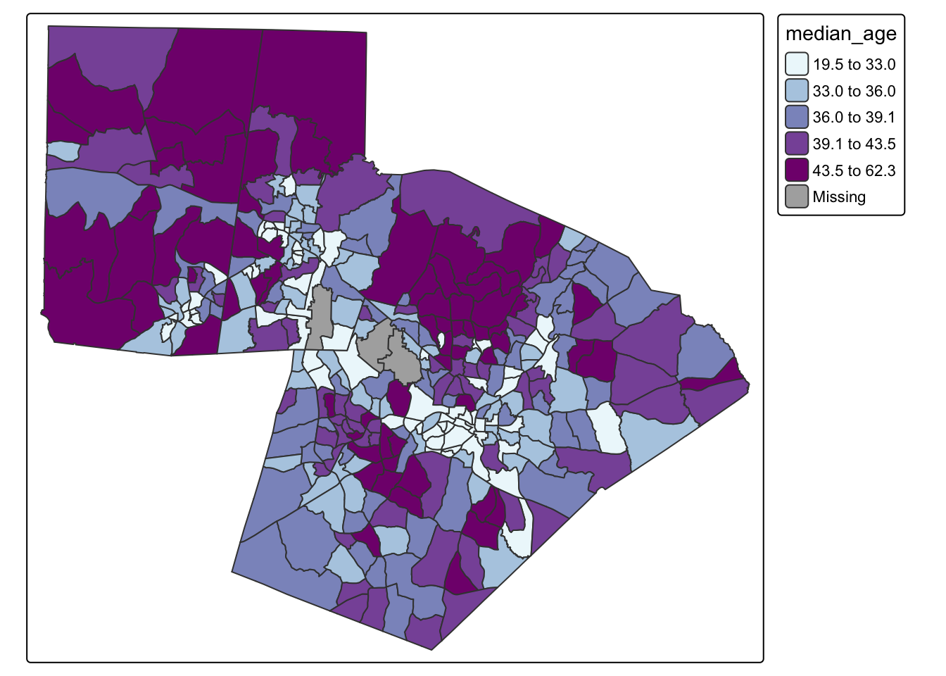
The following classification schemes will cover most of your uses:
So far, we have only made static maps. However, tmap has the availability to make interactive maps as well.
## make an interactive map
tmap_mode(mode = "view")
tm_shape(acs_tract_nc) + tm_polygons(fill = "median_age", fill.scale = tm_scale_intervals(values = "bu_pu", style = "quantile"))tm_shape(acs_tract_nc) + tm_polygons(fill = "median_age", fill_alpha = .3, fill.scale = tm_scale_intervals(values = "bu_pu", style = "quantile", n = 7))#change back to static plot
tmap_mode(mode = "plot")
tm_shape(acs_tract_nc) + tm_polygons(fill = "median_age",fill.scale = tm_scale_intervals(values = "bu_pu", style = "quantile", n = 5), fill_alpha = .3) +
tm_title("Median Age by Census Block Group") + tm_basemap("OpenStreetMap")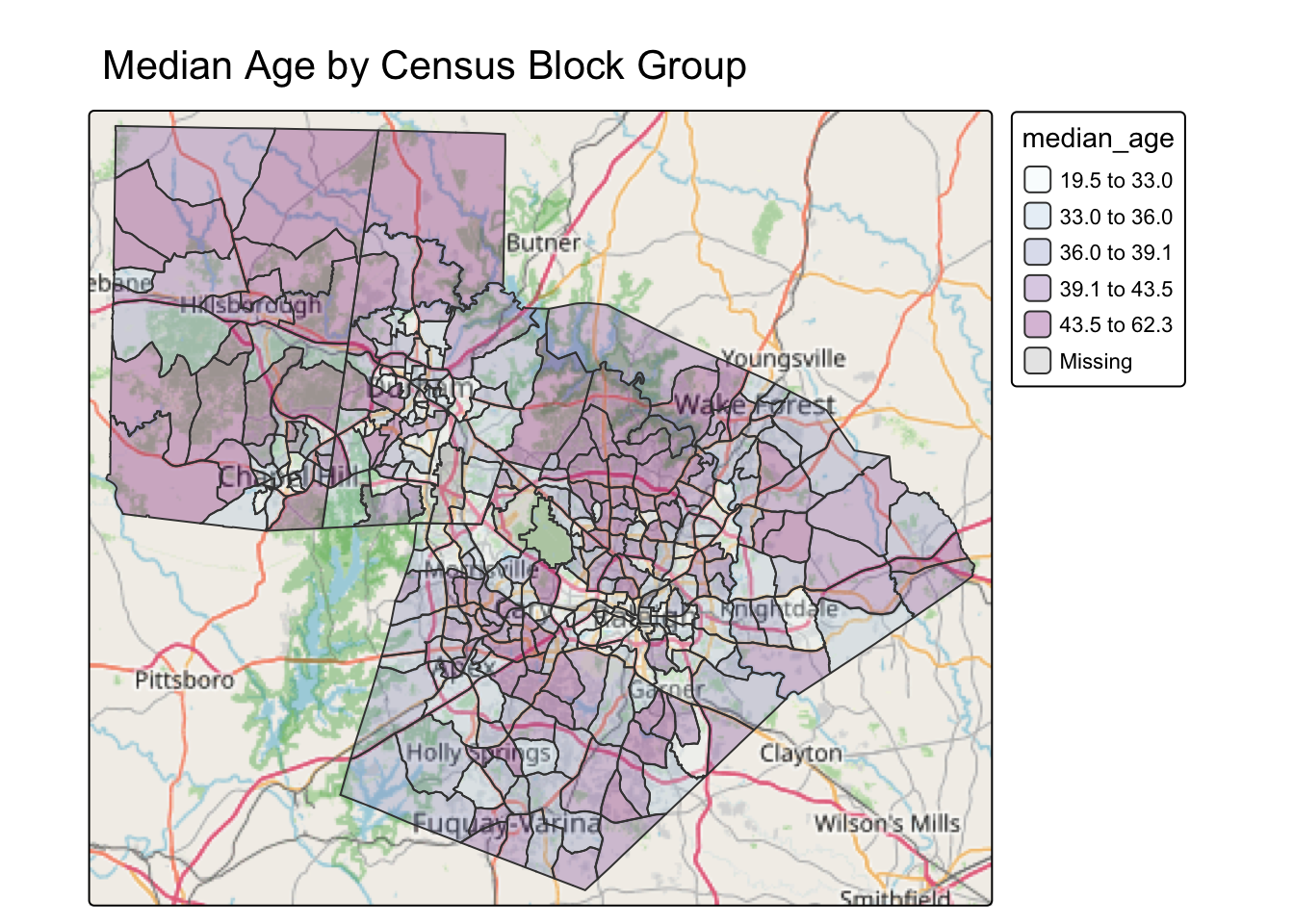
The following basemaps will cover most of your uses:
Using two different variable in the ACS data, create two well-designed maps where you select a classification scheme, and add transparency, a title, and a basemap. For one map, use size and color. For the other map, use color.
Create an interactive and static version of each map.
Then, figure out how to display the maps side by side (two-panel).